The Zeroth Rule of Presentations
14 Oct 2012
There are plenty of guides on the web which tell us how to design slides for presentations (see below for some pointers). You spend hours and hours working on tables, figures and text, and more hours on colours and spacings. But if you’re presenting in anything other than a large auditorium or a small boardroom, a lot of this effort goes to waste: most of the audience cannot see the bottom half of your slides.
I took the photo below at a conference last week:
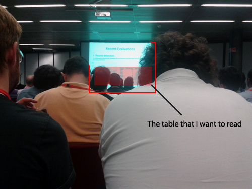
I had to lean to the left to take the shot. I wasn’t at the very back of the room but people around me were propping their backs every time the slide changed to see what was going on. What hurts the most is that the portion of the slide that was visible, almost always had no meaningful content in it.
Rule 0: Put the most important parts of your slides at the very top.
This might seem counter-intuitive at first. You might be tempted to spend the first half of the slide describing the context, and deliver the punchline at the bottom. Don’t do this. People might straighten their backs or lean to one side once or twice, but they will soon lose interest and start playing with their phones.
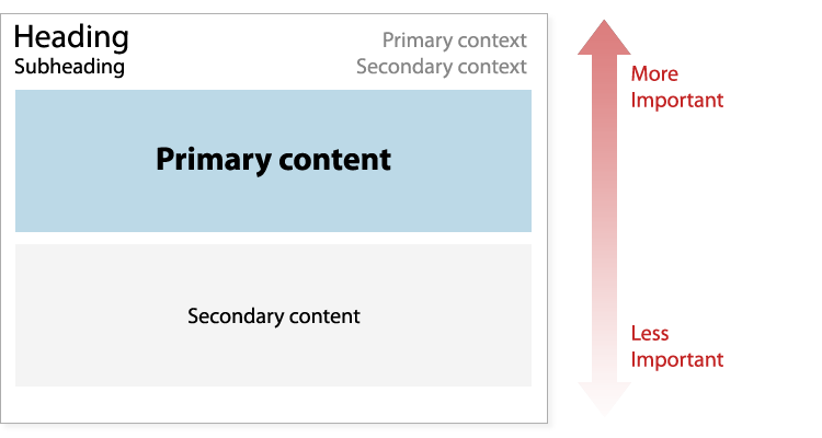
If you absolutely must provide some context, fill up the top quarter of the slide as much as you can. Don’t just place a massive centered heading that conveys no information whatsoever. If there are any details that the viewer might want to write down for future reference (e.g. a citation, details of your experimental setup, the name of your algorithm), put it here. Here’s one possible layout (although ideally there will be no need for context or secondary content):
And please do use large fonts. There is rarely any harm in doing so. See notes by Iain Murray, David Mackay, Matthew Might, Jonathan Shewchuk and Sharon Goldwater for tips on designing and giving presentations.